My Role
I led product design and worked with the executive team to define goals and metrics of success. I gathered user feedback, wireframed, prototyped, delivered high-fidelity mockups, and worked closely with our team of engineers during development.
The Challenge
As an early stage startup, our product and user base had evolved substantially in the past year. We were seeing larger, more established teams were starting to use Hive, which led to an influx of new customer feedback and customer requests. With the start of the new year, we knew it was time for a refresh. We wanted to ensure that the design of our product matched the quality our customers expected of us. In addition, we were cautious of feature creep and wanted to take this time to analyze and potentially simplify our product.
Understanding the Problem
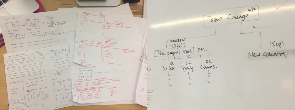
The first step in the project was deciding what to redesign and why. Before jumping into layouts and color palettes, we needed to understand issues with the current platform. I analyzed past customer feedback and further conducted 5 user interviews. This helped us determine the largest pain points in our current desktop app and identify actionable areas.
Feature Analysis
User interviews revealed some surprising insights about certain features of Hive. I conducted a feature analysis to see what percentage of users were actively using key features. Data showed that features such as notes and file storage were poorly adopted.
While our value proposition had always been an “all-in-one platform”, through user interviews and a feature analysis we began to see the relation between our two strongest features and how others were secondary to our user’s workflow. This data was eye-opening for the team and helped prioritize future launches as well as to simplify the interface for this redesign.
Goals of Redesign
After understanding the problem, we determined four goals for the redesign:
1. Bring focus back to action cards
2. Improve ease of navigation
3. Help new users better orient the platform
4. Visual design should reflect a more mature brand identity
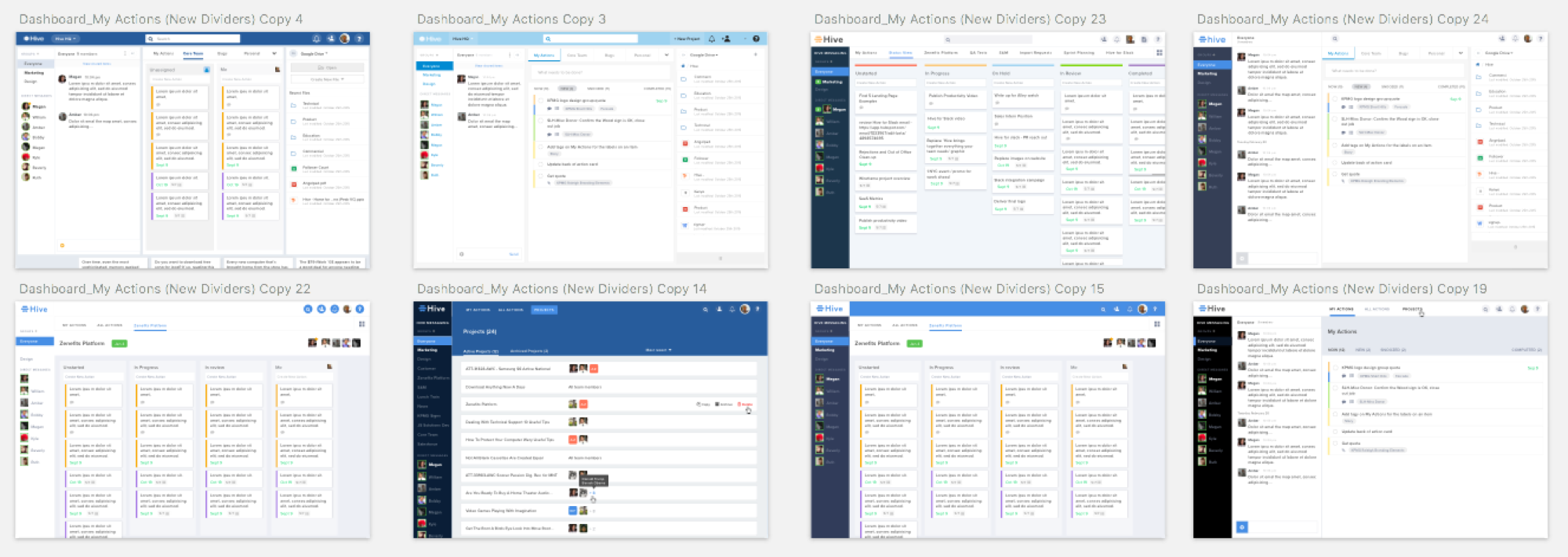
With these goals in mind, I began to sketch wireframes to explore a better flow and improved layouts. I tend to write more than I sketch at this stage - below is a look at some early sketches.
Learn & Iterate
With clear goals in mind, I generated quick wireframes and prototypes. I frequently shared mockups and clickable prototypes with the team to receive feedback early and often. Below is a look at a few early iterations.
Designing a Flexible System
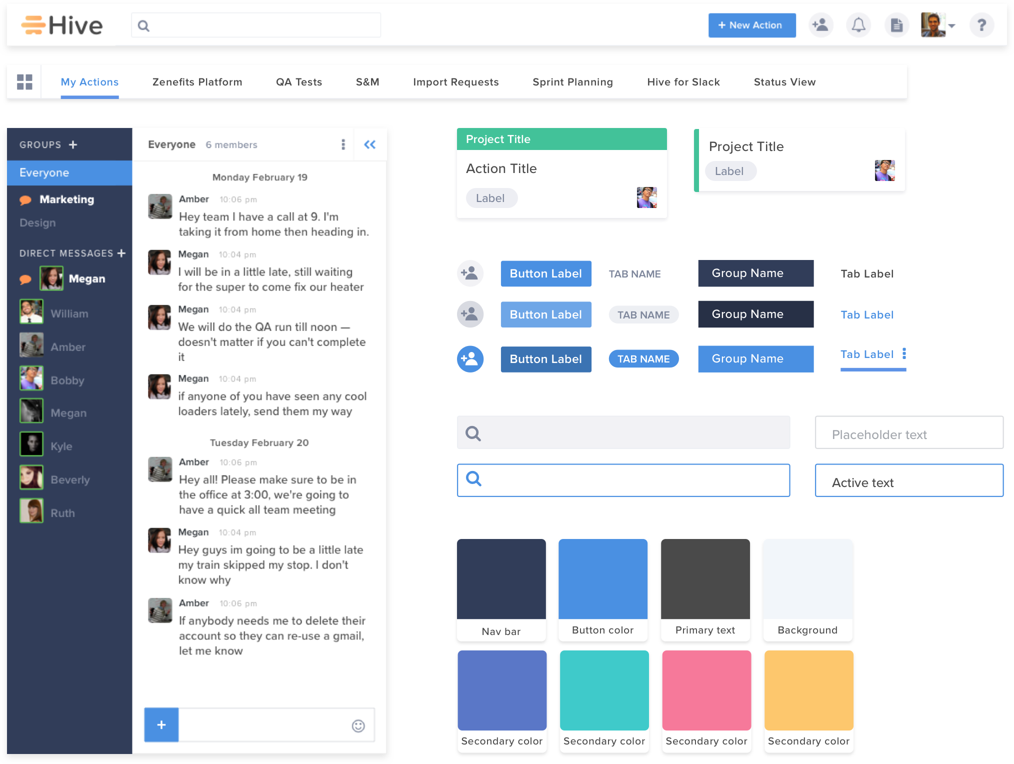
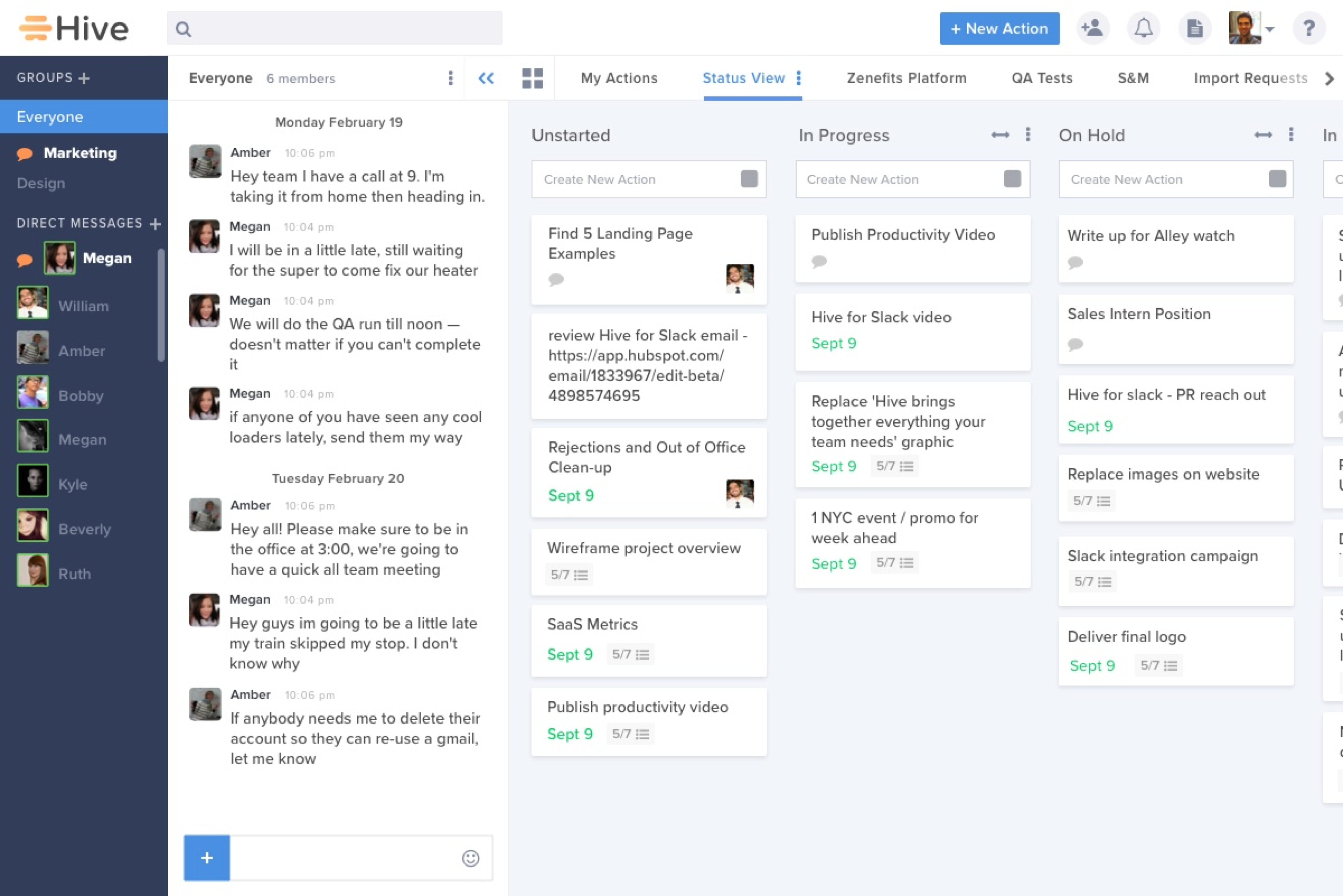
Using atomic design methodology, I began with designing the smallest components (“atoms”) and worked my way towards a larger design system. I created a professional, clean primary color palette with bright secondary colors to draw attention to important information such as project labels, due dates, etc. As I had taken over the design from a previous contractor, I was excited for the opportunity to document and create consistency in our visual elements.
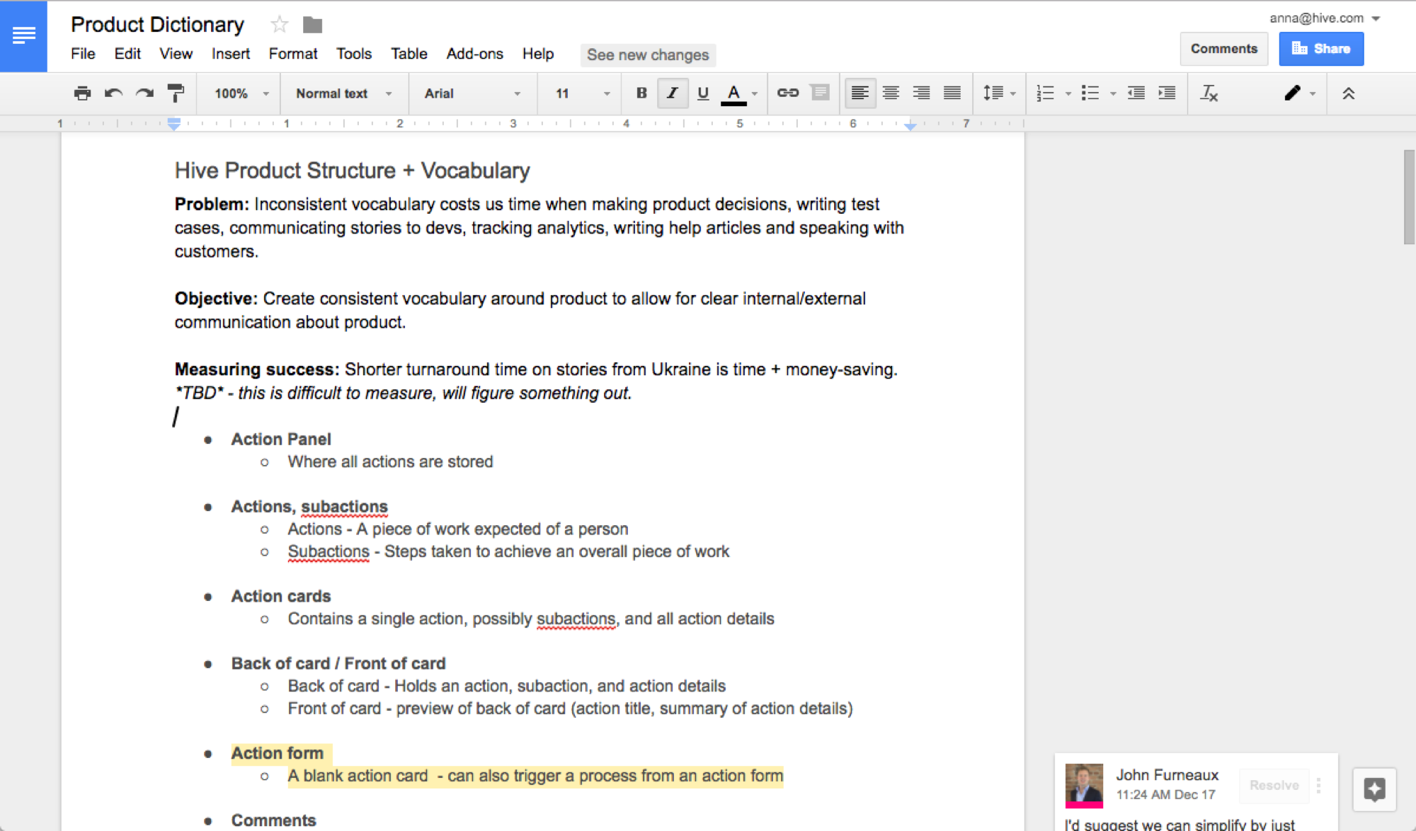
Additionally, I created a product dictionary to encourage consistent vocabulary around the product. Previously, inconsistent vocabulary created confusion when making product decisions, communicating stories to devs, tracking analytics, writing help articles, and speaking with customers. Using a shared language allows for clear internal and external communication about the product.
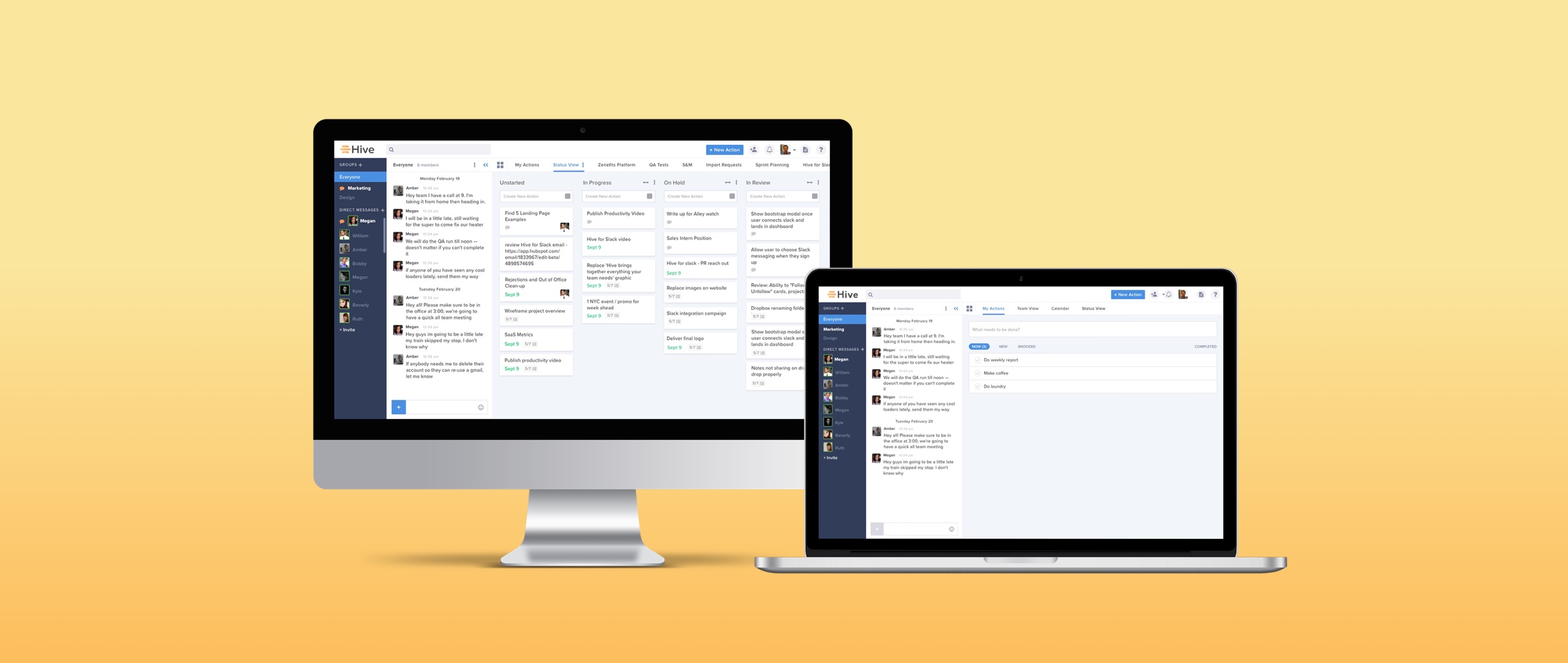
In with the New
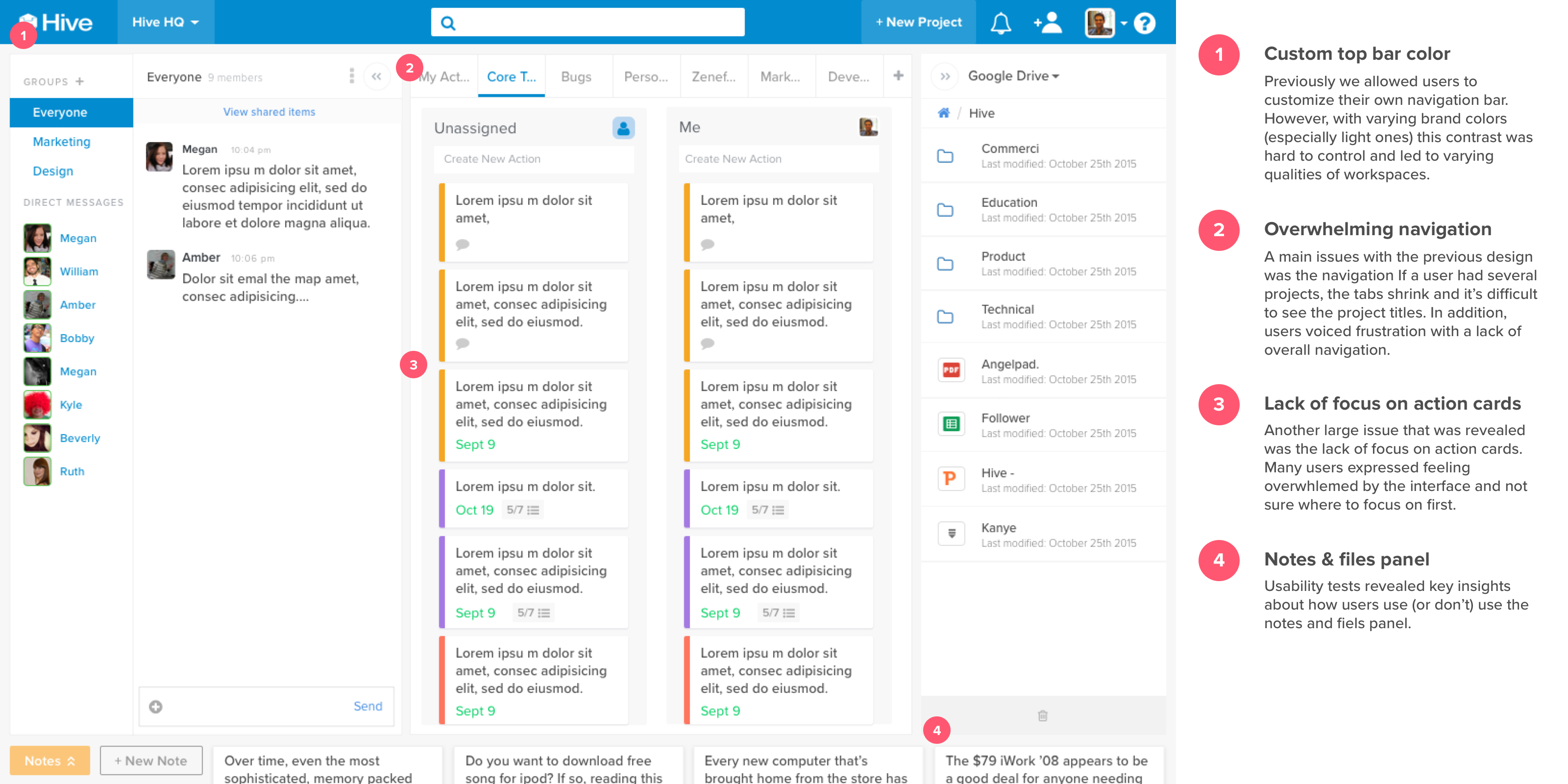
One of the primary challenges was to design a more efficient navigation system. Initial user interviews revealed that one of the biggest frustrations users faced was navigating between projects. Users reported that the navigation felt clunky and crowded. To solve this problem, we built a central dashboard for users to find projects and key information. We plan to further build out this dashboard for reporting purposes as well.
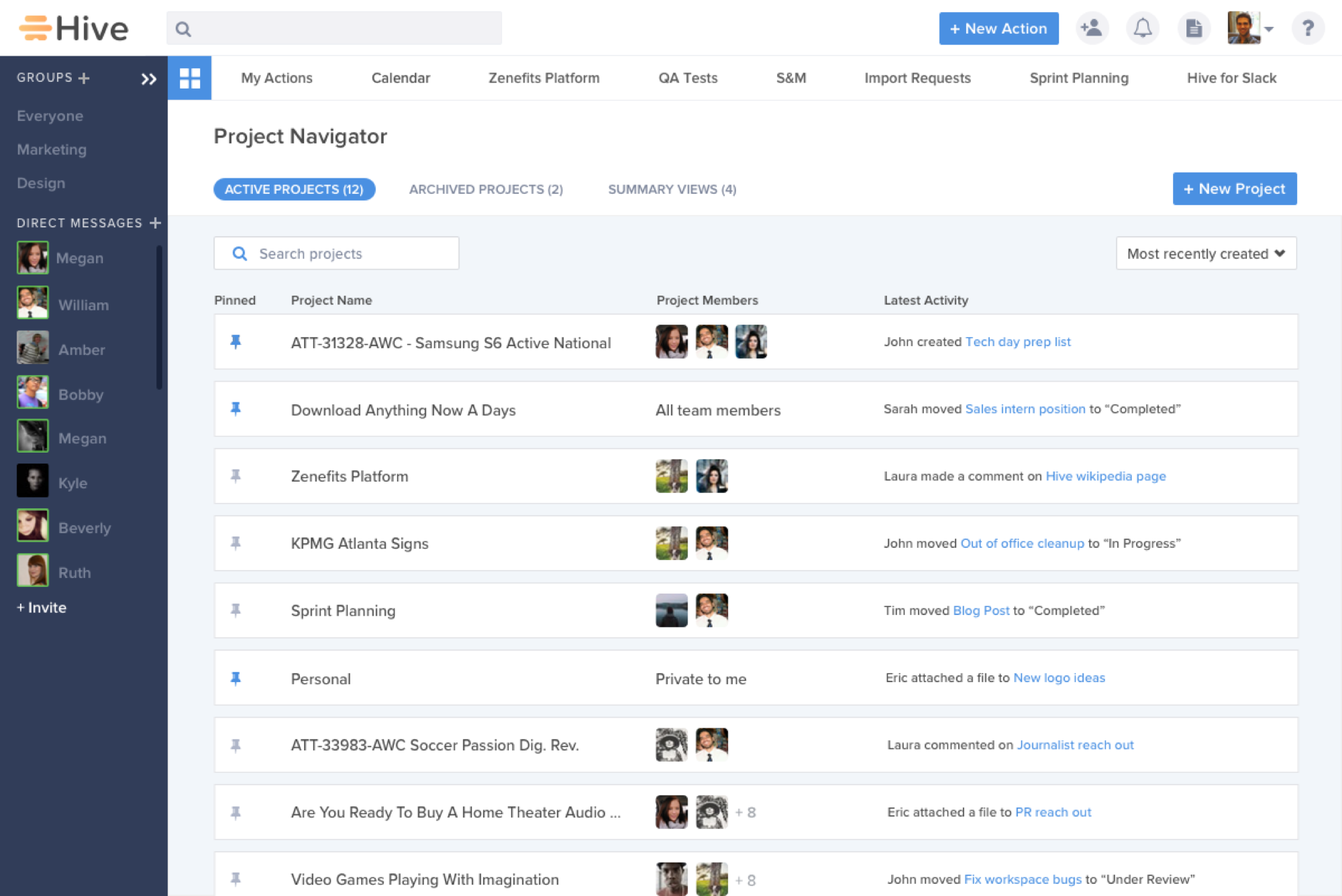
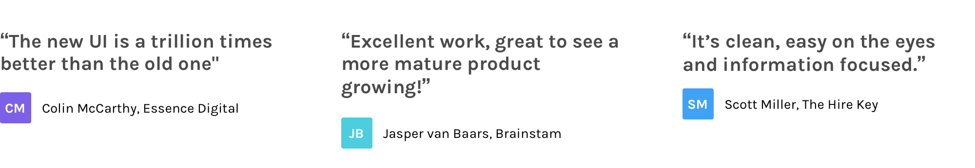
Overall, this project involved a large visual overhaul. The use of colors, typography, and hierarchy greatly improved the structure of the desktop app and provided visual flow that was severely lacking. Previously, users remarked that the design felt overwhelming and crowded. After the launch of the redesign, users felt that the design was “clean, easy on the eyes, and information focused”.
Conclusion
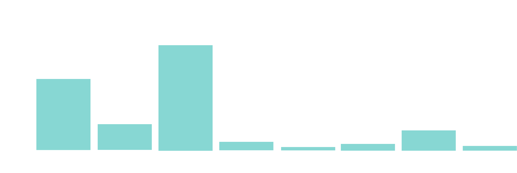
The redesign received top marks from 88% of users as well as incredible feedback both internally and externally. Below is are some snippets of customer feedback.