My Role
I was a UI Designer on a team with three other designers. A previous group had conducted the UX research and handed off wireframes, while my team was tasked with UI design and prototyping.
The Problem
Research shows that students have a stronger grasp of abstract concepts when taught through active learning. A sensor chip application will help bridge the gap between abstract theory and the real world. The design should be easy to use in an active environment, data should be easy to digest, and tailored towards students and teachers.
Wireframe Improvements
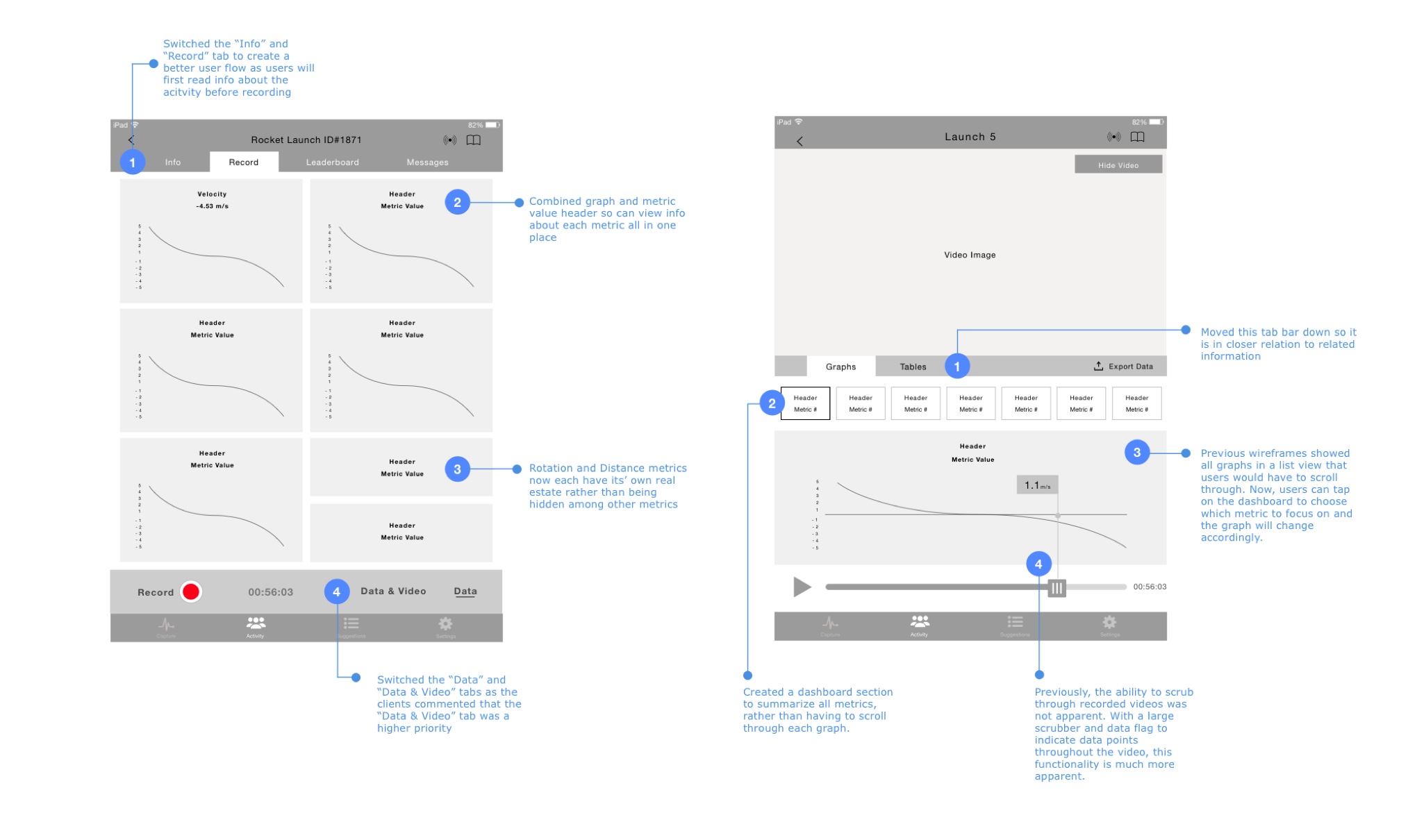
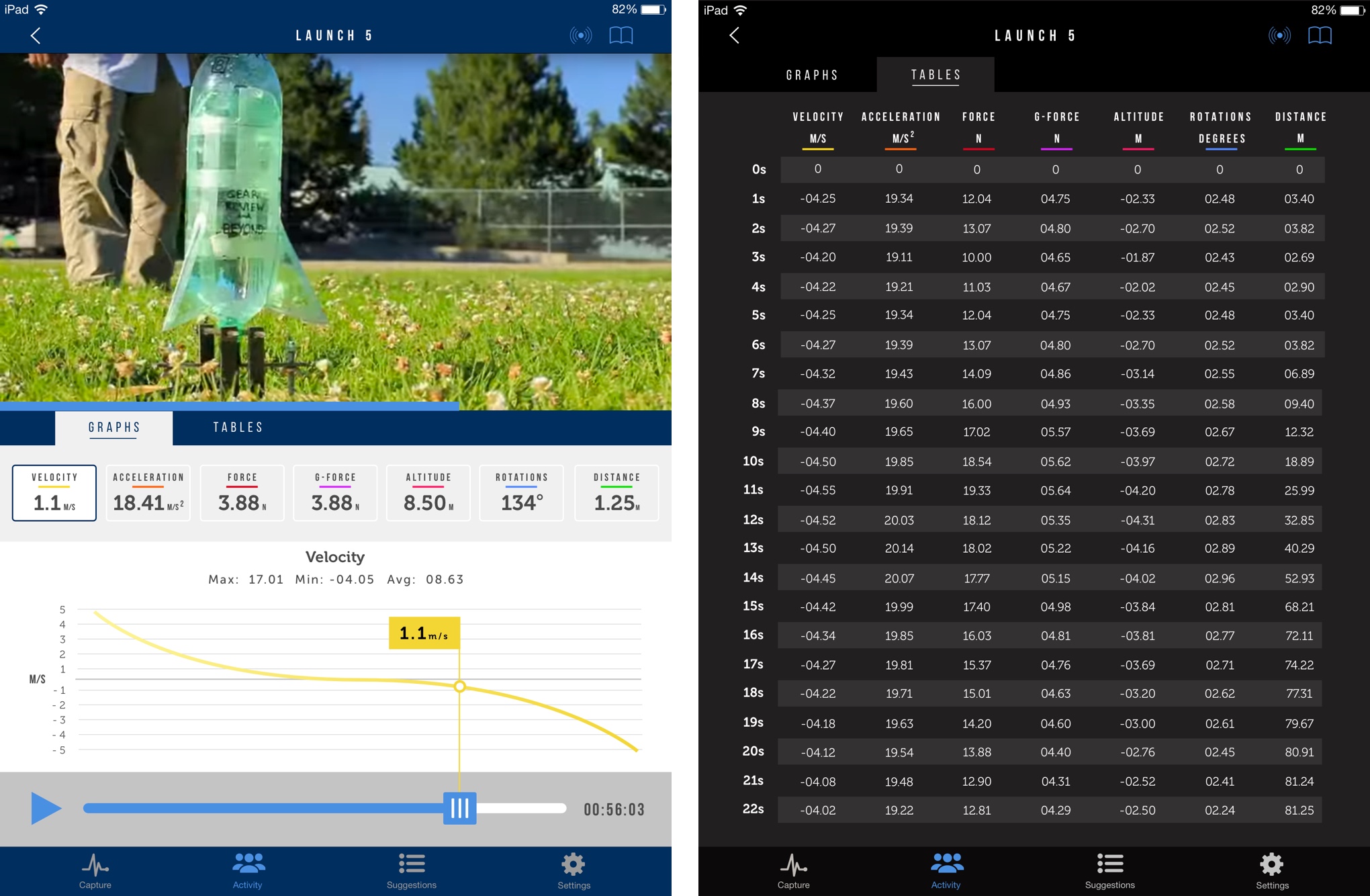
As I began the visual design process, I realized that the layout could be improved in several instances on the wireframes. My largest concern was with the way data was organized and represented in the original wireframes.
As the graphs and data numbers fluctuate in real time, the original layout would be over-whelming for the user to view and understand. We discussed this with the client and they were open to making small alterations to the wireframes.
Style Exploration
After analyzing different trends, we individually explored and created style tiles to present to the client. I presented 3 style tiles tbat explored different types of layout, typography, and color palettes. We shared this with our client early on to get a feedback for visual direction.
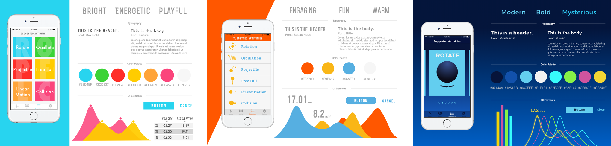
We each presented very different directions and the client was happy with our depth of exploration. However, our client was concerned about the use of the app in different environments (indoor vs outdoor) and was unsure if a lighter or darker background would be better.
We researched best practices for designing for various physical environments and found that color difference plays a minor role in legibility under daylight conditions. We discovered instead it’s best to design with less detail and high contrast. This research helped us keep the context of the user in mind throughout the design process.
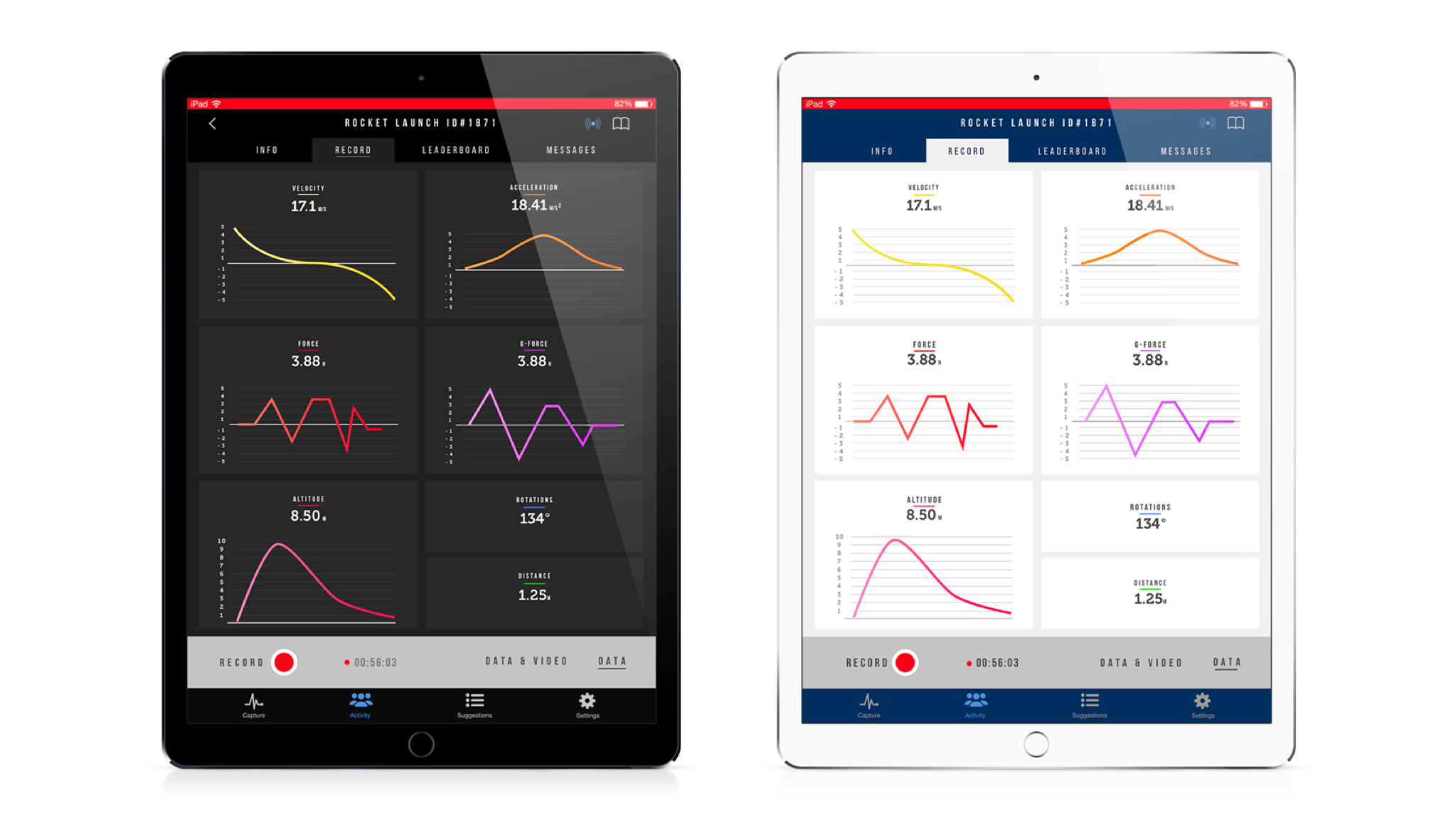
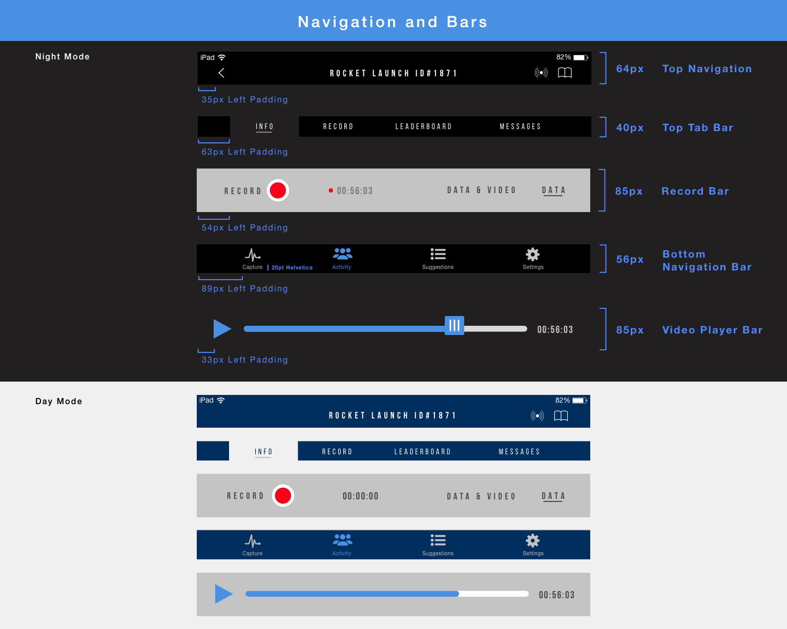
Day & Night
Following client feedback, I combined elements from the modern, bold style and bright, energetic style to create designs for both night and day mode. This allows the user to change their viewing preferences based on their environment. Although the two modes look different, the actual variances are minimal as I acknowledged concerns that developers may have with coding two modes.
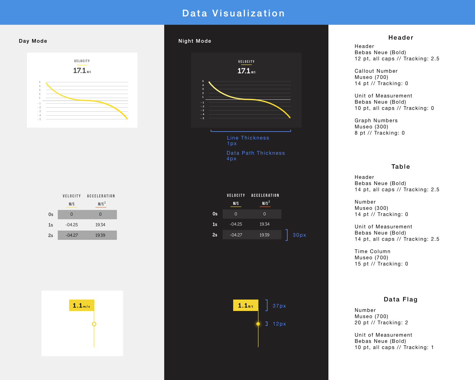
As you can see in the snapshot below, the variances between the modes include: background color, navigation bar colors, and some text color.
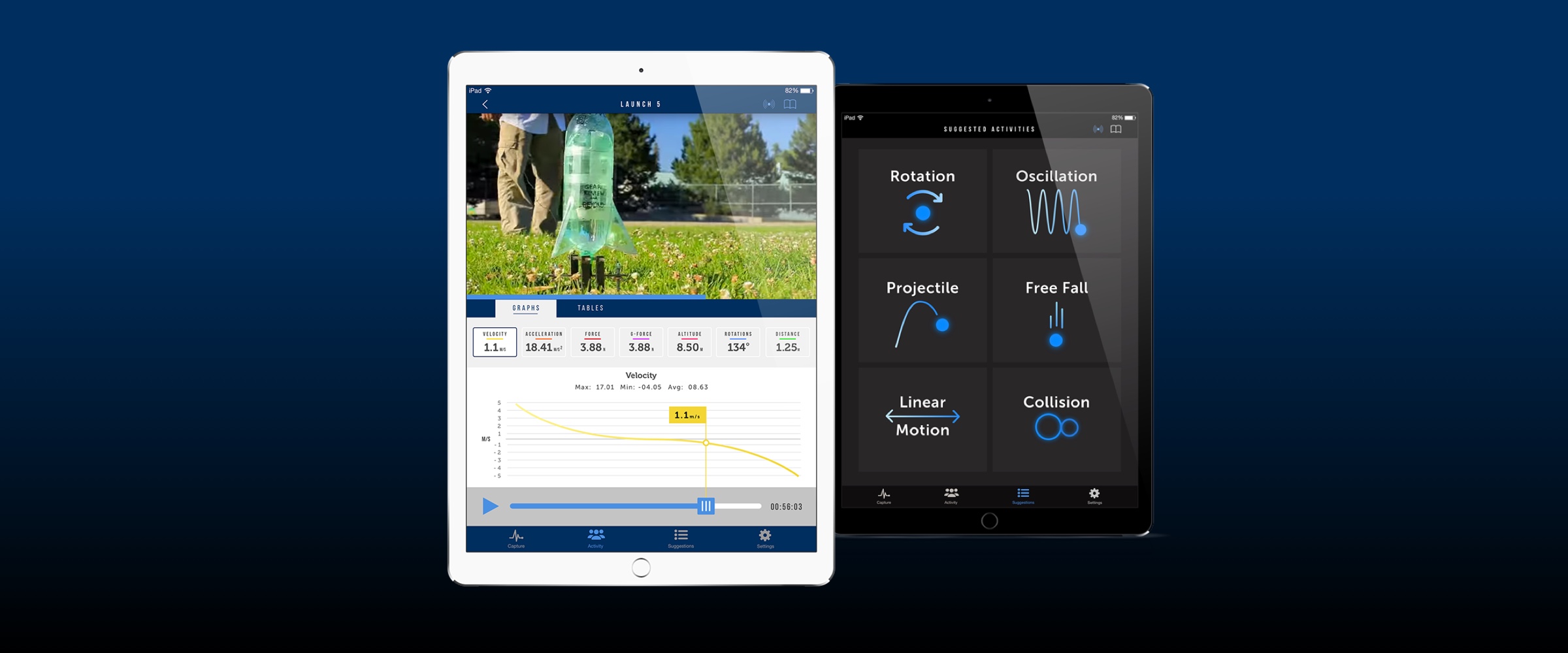
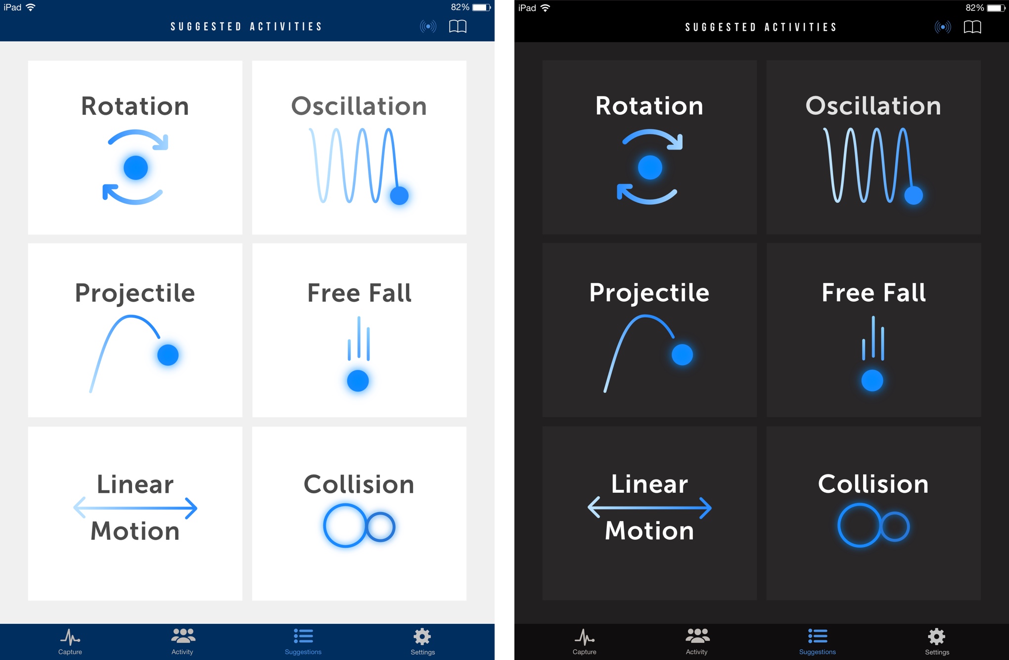
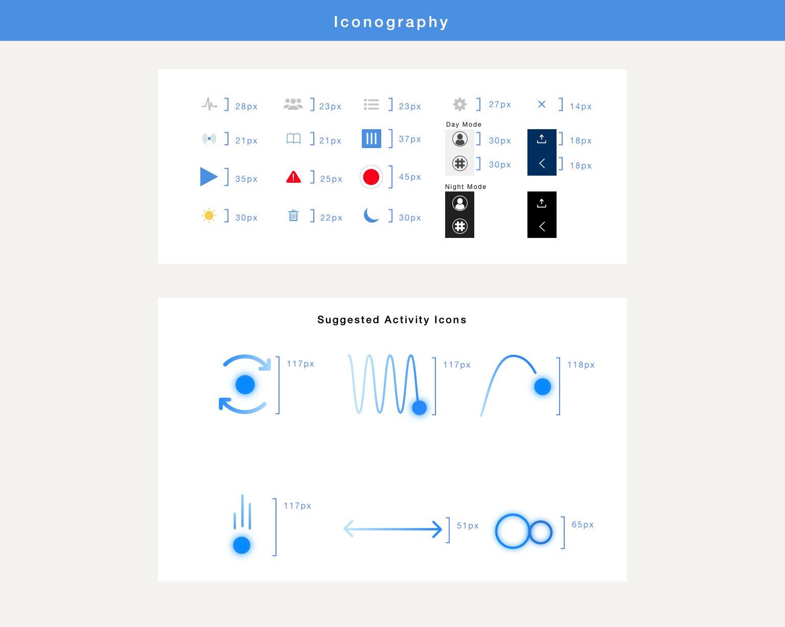
Suggested Activities
To keep the app friendly and engaging, I took a page from our education domain analysis and used interesting iconography to capture the user’s attention.
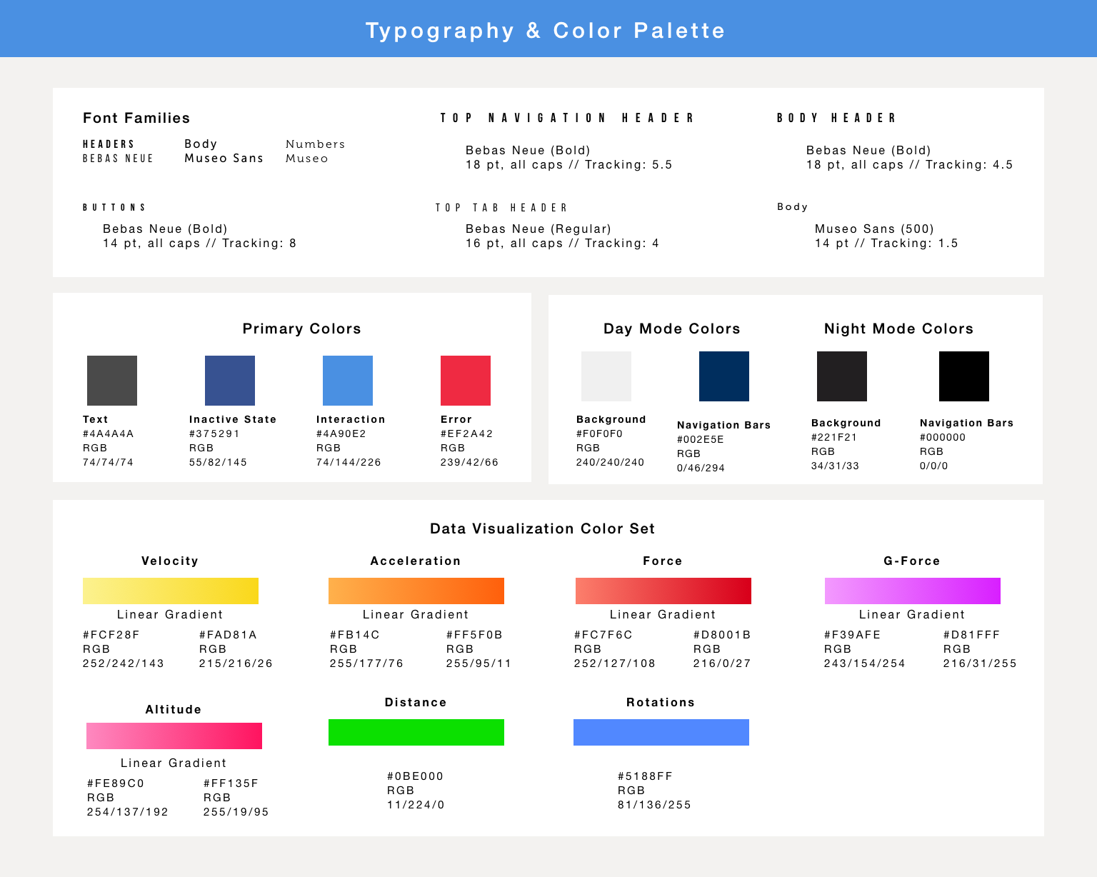
Data Visualization
I used a separate color set for data visualization and color-coded each metric. The data visualization colors are bright and vibrant, which creates a high contrast with the neutral background. This also ensures that the data would be easy to read in various environments.
Style Guide
Prototype
In addition to high fidelity mockups, I also delivered a clickable prototype. Please click here for an optimal experience.