My Role
UX/UI Designer. I led the information architecture and UX design. I designed the UI with art direction from Simon Goetz, partner at Milkshake Studio.
The Problem
The original Vermillion site had become outdated and hard to manage as content was added and edited throughout time. Vermillion approached us to redesign the look and feel of the website as well as to improve the flow of content.
Content Audit
To kickoff the project I conducted a full content audit of the original Vermillion site. This was crucial in setting the stage for the rest of the project as it allowed us to improve the information architecture and create a content strategy that would later help drive design decisions.
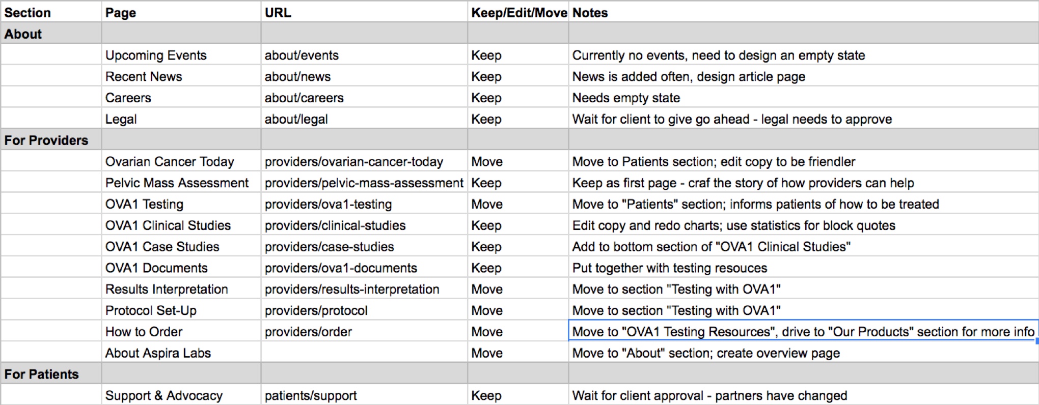
Vermillion, Inc. focused on three main audiences: women looking for education on ovarian cancer, providers looking for information on treatment, and customers looking for diagnostic solutions. Our content audit showed that the original site read like a dry, scientific textbook and content was fragmented and hard to find.
We determined that the Aspira site experience should convey an informative but approachable tone towards women’s gynecologic health. In addition, our content strategy determined which pages needed copywriting, what content could be consolidated or removed, and restructured the site to speak to each audience.
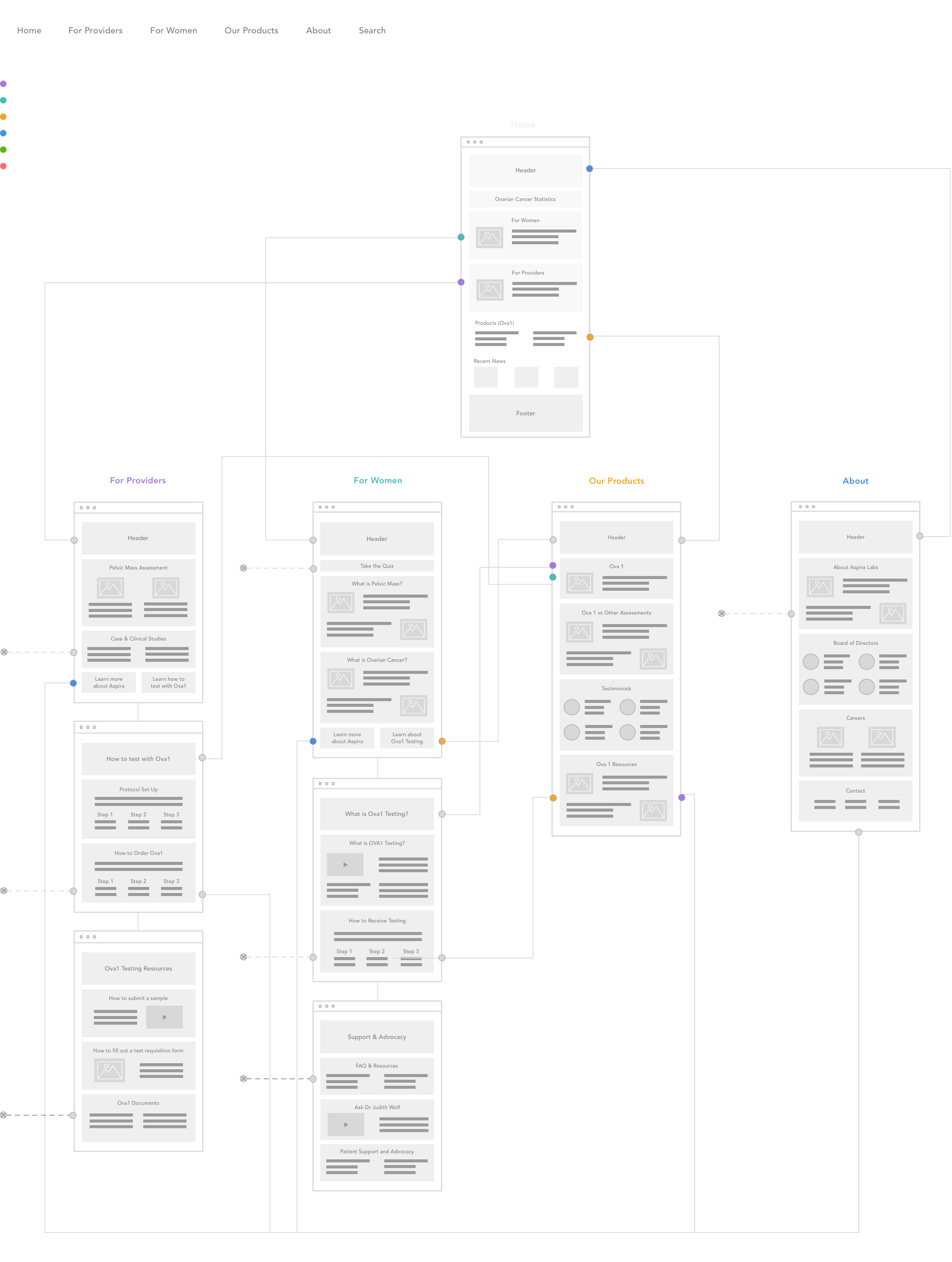
Wireframes
We worked through a ton of lo-fi wires to help the client understand how the user will move through the site and interact with various types of content. The top navigation spoke to each individual audience and we also surfaced the most relevant content to the home page. This helped us drive our target audience through the correct flow when they entered the site.
Look & Feel
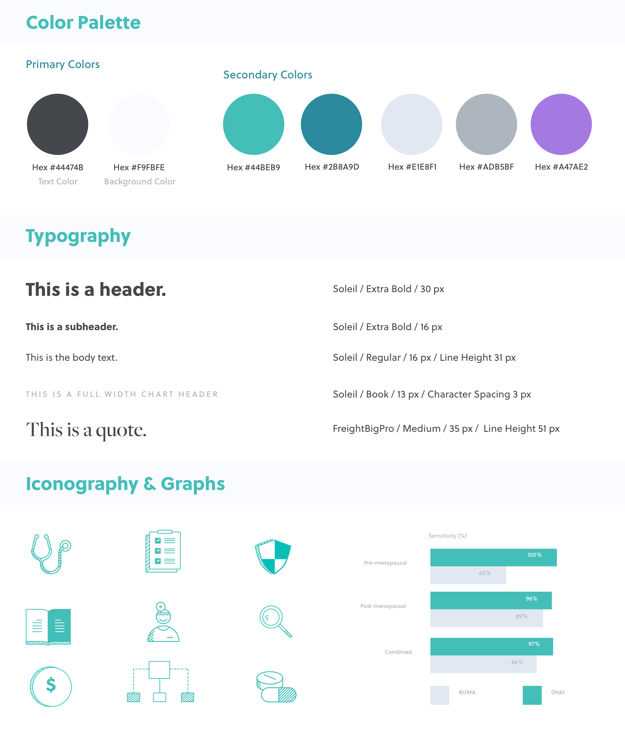
To supplement the newly edited content, we also introduced a set of friendly icons and graphs. This helped break up long forms of text and to emphasize important statistics. See below for a snapshot of the final UI style guide.
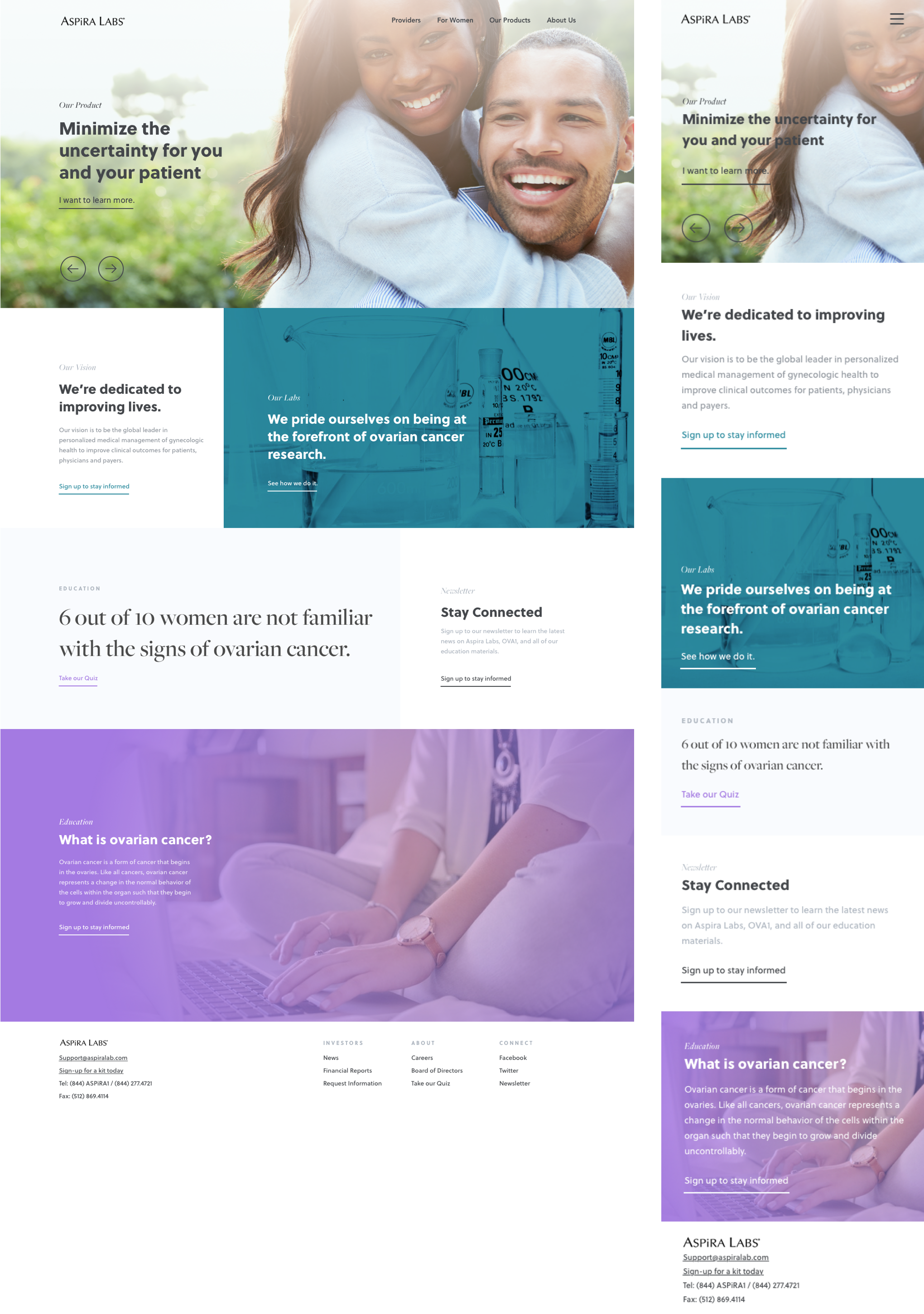
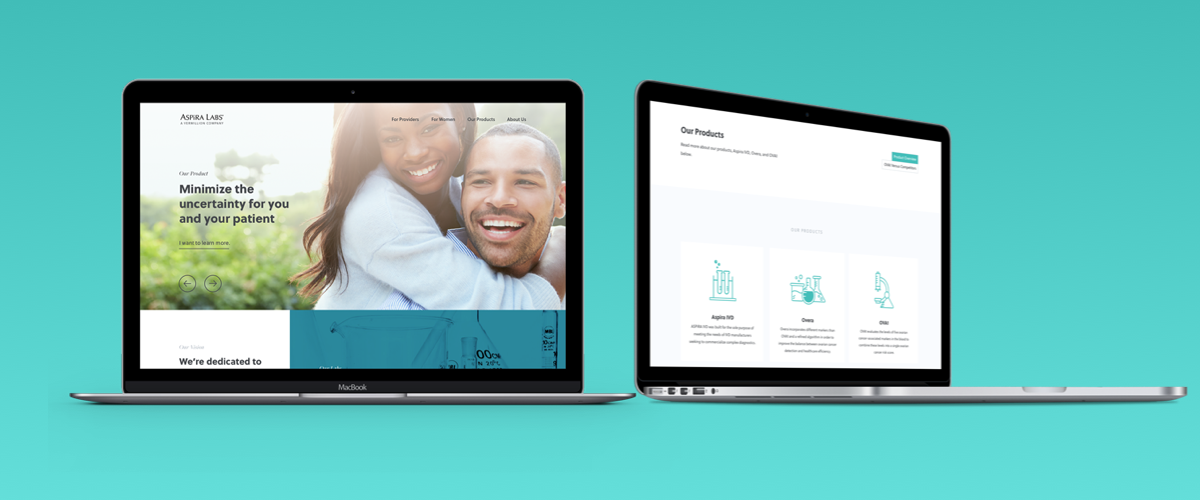
Homepage
We started with the homepage and explored different style directions. Through intensive exploration and communication with the client, we landed on the perfect combination of professional, trustworthy, and approachable.